
Problem:
Teaching children about their emotions is a very important part of development and is imperative in creating a healthy, functioning society.
Solution:
Create an app to teach children how to identify and regulate their emotions.
Product Duration:
Four (4) Weeks
April 2023 - May 2023
My Role:
UX/UI Designer and Researcher
Wireframing
High and Low-Fidelity Prototyping
Usability Testing
Iterating on Designs
Tools Used:
Figma
Canva
WCAG Guideline Tools
Accessibility Checker
Understanding the User:
To fully understand my target audience and the presenting problem, I interviewed child therapists to see what strategies/skills are the most helpful for socio-emotional development. This information guided my designs to include the most pertinent information.
I also drew on my experience as a child trauma therapist when creating different tools for the children to interact with while using the app.
“Play is such an important part of the learning process.”
—Marie D. (Child Therapist)
“I really think I would have been so much better off if I knew it was okay to feel all the things as a kid.”
—Josh W. (Play therapist)
Target Population:
My target population is children ages 6-12, as well as their parents/caregivers/mental health professionals.


Identifying User Needs:
I completed a competitive analysis to identify current resources and to find gaps in the market. The following opportunities were identified:
A function that sends daily affirmations to the child’s inbox on the app.
A mood chart function that teaches children how to identify and track their moods.
Initial Design Concepts:
I completed the crazy eights and how might we design exercises to generate as many ideas as possible. I kept market gaps and suggestions from child therapists in mind when generating ideas.
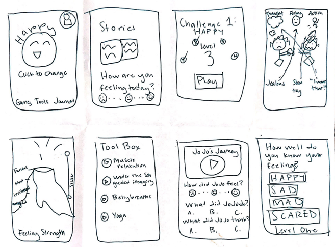
Paper Wireframing:
I created paper wireframes to streamline the iteration process. This helped me rapidly create different variations. I then took components from my sketches to create the final design.
Digital Wireframes and Low-Fidelity Prototyping:
Once I completed my paper wireframes, I hopped on Adobe XD and created digital wireframes. This laid the foundation for me to begin creating my low-fidelity prototype.

User Testing:
I started by creating a detailed research plan outlining goals for the study and a step-by-step guide for completion. This included an introduction, research questions, key performance indicators (KPIs), methodology, and a script to ensure consistency between each research session.
Usability Study Findings:
Users wanted a larger surface area to click when selecting images in the game.
3 out of 5 users reported they had difficulty clicking the small check box in the corner of the images in the game.
Users want parents included in the process
4 out of 5 users reported they would like a way for parents to be included in teaching the skills.
Users want audio prompts throughout the app
5 out of 5 participants suggested audio be added to read text aloud to children.
What happened next:
The issues identified by the users were fixed, and a second usability study was completed. Once all major issues were resolved, I began to work on high-fidelity mockups.
High-Fidelity Responsive Mockups:
I began by creating a brand guide and vision board to help make the design process move more swiftly. I added components to the asset panel to help me maintain consistency across my designs and to make my life just a tiny bit easier. Once that was complete, I got to work adding images and colors. I used Gestalt principles to guide my designs and to improve usability and aesthetics.

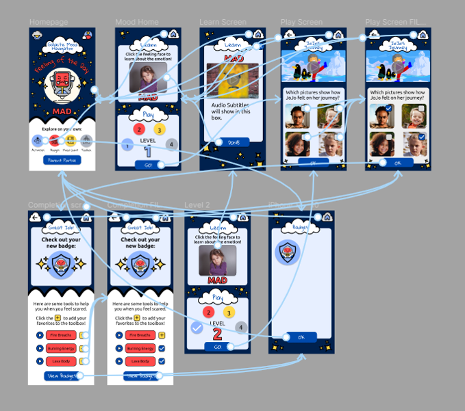
High-Fidelity Prototype:
My high-fidelity prototype took the user through the experience of viewing the emotion of the day, learning about the emotion, and engaging in an activity to apply the knowledge. They were then able to add a new tool to their toolbox and could view their badges.
Accessibility Considerations:
Colors were chosen to reflect the correct ratios per WCAG guidelines.
All written text will also be accompanied by audio to account for various reading levels and visual impairments.
The text was kept short and sweet to ensure children can attend to the information presented in the app.
I realized I have room to improve my graphic design skills (especially game design). I am currently taking digital art courses on SkillShare to improve. I consider myself a T-shape designer with expertise in user research but want to become proficient in other areas, such as UI design. I realize this will take time, but I am dedicated and eager to learn more! That being said, my next steps include:
Takeaways:
Partner with a digital artist to get graphics that look more futuristic.
Complete user research with children aged 6-12 to make sure the language is developmentally appropriate and that they understand the tasks.
Continue to iterate on the design of the project as a whole.