Problem:
Users wanted an easy way to schedule their events online without having to call the venue.
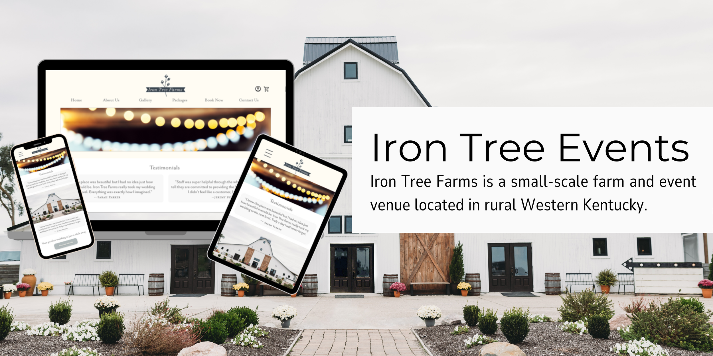
Solution:
Iron Tree Farms is a small-scale farm and event venue that hosts rustic weddings. Iron Tree Farms offers online scheduling and different packages to fit most budgets.
Product Duration:
Four (4) Weeks
March 2023 - April 2023
My Role:
UX/UI Designer and Researcher
Wireframing
High and Low-Fidelity Prototyping
Usability Testing
Iterating on Designs
Tools Used:
Adobe XD
Canva
WCAG Guideline Tools
Accessibility Checker
Understanding the User:
To fully understand my target audience and the task at hand, I created surveys that were distributed to individuals who have recently planned a wedding or are planning one now. These were used to gather qualitative information on their experience scheduling an event venue.
I thought one of the major issues would be package options, but found that this was irritating but not a major pain point for users. Most people just wanted an easy way to book their events directly through a venue’s website.
“I work full time and have kids so I’m very limited on time. I wish more venue websites would let you see their calendars and schedule online.
—Sarah S.
“I’m sure calling isn’t a big deal for most people, but I HATE talking on the phone...”
—Kara C.
Target Population:
My target population is anyone that is currently planning a wedding and needs to schedule a venue. They are likely between the ages of 18-65. Based on my initial research, I created two personas.


Identifying User Needs:
I completed a competitive analysis to identify current resources available and to find gaps in the market. The following opportunities were identified:
A calendar view that allows users to see what dates are available to book.
A way to reserve the desired date and pay the deposit completely online.

I also completed empathy maps to help me gain a better understanding of the pain points users experience when trying to book an event venue. Here is the aggregate empathy map!
Initial Design Concepts:
I completed the crazy eights and how might we design exercises to generate as many ideas as possible. The limited time to complete the crazy eights task kept me from overthinking things. As a result, I came up with some pretty fun concepts!

Information Architecture:
I wanted to keep the site simple and easy to navigate, so I used a hierarchical approach when structuring the information architecture. This approach allowed me to highlight important information, then break it down into more specific subcategories.

Paper Wireframing:
I created paper wireframes going through the intended user flow. I started wireframing for the desktop design first. In the future, I will likely take a mobile-first approach.

Digital Wireframes:
Once I completed my paper wireframes, I hopped on Adobe XD and created digital wireframes. This laid the foundation for me to begin creating my low-fidelity prototype.
Low-Fidelity Prototyping:

User Testing:
I started by creating a detailed research plan outlining goals for the study and a step-by-step guide for completion. This included an introduction, research questions, key performance indicators (KPIs), methodology, and a script to ensure consistency between each research session.
Usability Study Findings:
Users want multiple entries to the calendar function.
4 out of 5 users determined that the calendar function is very important to them. They suggested a link on the homepage, in addition to the menu link at the top.
Users want a way to view the calendar as a guest.
5 out of 5 users agreed that they would like to have a way to view the calendar without creating an account or signing in to a current account.
Users want to see a picture of the venue on the homepage.
3 out of 5 users thought the testimonials were nice but thought the focus of the landing page should be the venue itself.
What happened next:
The issues identified by the users were fixed and a second usability study was completed. Once all major issues were resolved, I began to work on high-fidelity mockups.
High-Fidelity Responsive Mockups:
I began by creating a brand guide and vision board to help make the design process move more swiftly. As I designed my mockups, I added components to the asset panel. This helped me maintain consistency across my designs and made my life easier. Once that was complete, I got to work adding images and colors. I used Gestalt principles to guide my designs and to improve usability and aesthetics.

High-Fidelity Prototype:
My high-fidelity prototype took the user through the experience of viewing the event calendar, picking an appointment date/time, and paying the deposit.

Takeaways:
For this particular project, I designed using a desktop-first approach. When I tried to scale down for the mobile screen size, I couldn’t fit everything that I originally wanted to include. Next time, I will take a mobile-first approach so I can make sure I have enough space for the most important information.